Visualizing Patient Waiting Time Distribution#
Illustrates the distribution of patient waiting times (in minutes) between scheduled appointment time and actual start. This visualization helps assess service efficiency and identify bottlenecks or systematic delays in outpatient operations.
Function Overview#
Function: medscheduler.utils.plotting.plot_waiting_time_distribution(df)
Inputs:
df (pd.DataFrame)— Appointment table containing awaiting_timecolumn (in minutes).
Returns: matplotlib.axes.Axes — Histogram showing the frequency of waiting times across appointments.
Validation & error handling:
Missing column → raises
ValueError("DataFrame must contain a 'waiting_time' column.").Empty or non-numeric values → returns
_empty_plot("No valid data available for 'waiting_time'.").
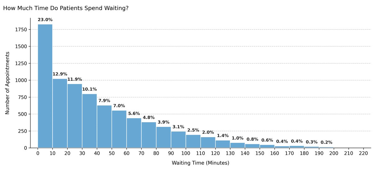
Output Description#
X-axis: Waiting time (minutes), grouped into 10-minute intervals.
Y-axis: Number of appointments within each waiting-time range.
Bars: Represent frequency counts of waiting durations per bin.
Color scheme: Primary Medscheduler blue (
#67A7D4).Filtering: Bins representing <0.1% of total data are excluded for clarity.
Annotations: Each bar displays its percentage of the total sample.
Style: Clean, grid-based histogram with left-aligned title and no top/right spines.
This plot provides visibility into clinic throughput and punctuality, indicating whether patients tend to wait short or long periods before being attended.
Example#
from medscheduler import AppointmentScheduler
from medscheduler.utils.plotting import plot_waiting_time_distribution

# Generate synthetic appointment dataset
sched = AppointmentScheduler()
slots_df, appts_df, patients_df = sched.generate()

# Visualize the waiting time distribution
ax = plot_waiting_time_distribution(appts_df)
ax.figure.show()  # optional when running interactively
Output preview:
The histogram below shows the distribution of patient waiting times in minutes. Each bar represents the number of appointments falling within a specific waiting-time range, with percentage labels above the bars.
Next Steps#
Compare waiting and duration trends: Visualizing Appointment Duration Distribution
Learn how waiting times are simulated: Appointment timing
Explore punctuality and patient flow: Patient flow
Adjust randomness and timing variability: Randomness and variability