Visualizing Appointment Outcomes by Status#
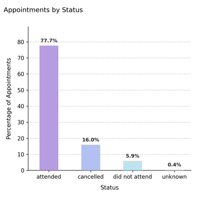
Displays the percentage distribution of appointments by outcome status (e.g., attended, cancelled, did not attend, unknown) up to the scheduler’s reference date (ref_date). This visualization provides a concise summary of historical appointment behavior, highlighting how patients interact with scheduled care.
Function Overview#
Function: medscheduler.utils.plotting.plot_appointments_by_status(df, *, scheduler, date_col='appointment_date', status_col='status')
Inputs:
df (pd.DataFrame)— Appointment table containing at least the specifieddate_colandstatus_col.scheduler (AppointmentScheduler)— Must define aref_dateattribute representing the temporal cutoff for completed appointments.date_col (str)— Column name for appointment dates. Default:"appointment_date".status_col (str)— Column name for appointment statuses. Default:"status".
Returns: matplotlib.axes.Axes — Bar chart showing the relative percentage of each appointment status category.
Validation & error handling:
Missing columns → raises
ValueError("DataFrame must contain columns: …").Missing
scheduler.ref_date→ raisesValueError("Scheduler must have aref_dateattribute.").Empty after filtering (
<= ref_date) →_empty_plot("No data available after filtering by reference date.").
Output Description#
X-axis: Appointment statuses (
attended,cancelled,did not attend,unknown).Y-axis: Percentage of appointments in each category.
Bars: Colored by status using the Medscheduler palette:
attended=#B69DE1cancelled=#B3C1F2did not attend=#BDE3F0unknown=#E5E5E5
Annotations: Displays percentage labels above each bar.
Style: Minimalist layout, dashed Y-grid, left-aligned title, and color-coded text for clarity.
This chart helps quickly assess attendance reliability and cancellation behavior across the simulated dataset.
Example#
from medscheduler import AppointmentScheduler
from medscheduler.utils.plotting import plot_appointments_by_status

# Generate sample dataset
sched = AppointmentScheduler()
slots_df, appts_df, patients_df = sched.generate()

# Visualize distribution of appointment outcomes before the reference date
ax = plot_appointments_by_status(appts_df, scheduler=sched)
ax.figure.show()  # optional when running interactively
Output preview:
The chart below displays the percentage distribution of appointment outcomes prior to the reference date, highlighting proportions of attended, cancelled, and missed appointments.
Next Steps#
Compare with future appointment forecast: Visualizing Upcoming Appointment Outcomes
Explore definitions and probabilities of each outcome: Attendance behavior
Review how reference dates affect filtering: Date ranges and reference date
Adjust attendance and cancellation rates: Customization options