Visualizing Upcoming Appointment Outcomes#
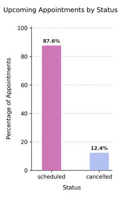
Displays the percentage distribution of scheduled and cancelled appointments for dates after the scheduler’s reference date (ref_date). This forward-looking chart helps evaluate upcoming workload and cancellation patterns in the near future.
Function Overview#
Function: medscheduler.utils.plotting.plot_appointments_by_status_future(df, *, scheduler, date_col='appointment_date', status_col='status')
Inputs:
df (pd.DataFrame)— Appointment table containing at least the specifieddate_colandstatus_col.scheduler (AppointmentScheduler)— Must include aref_dateattribute indicating the start of the forecast window.date_col (str)— Column name with appointment dates. Default:"appointment_date".status_col (str)— Column name with appointment statuses. Default:"status".
Returns: matplotlib.axes.Axes — Vertical bar chart showing the proportion of future appointments by status.
Validation & error handling:
Missing columns → raises
ValueError("DataFrame must contain columns: …").Scheduler without
ref_date→ raisesValueError("Scheduler must have aref_dateattribute.").No future rows (
date > ref_date) →_empty_plot("No future appointments available after reference date.").
Output Description#
X-axis: Appointment statuses (
scheduled,cancelled, etc.)Y-axis: Percentage of future appointments.
Bars: Color-coded by status using the Medscheduler palette:
scheduled=#CD77B6cancelled=#B3C1F2
Annotations: Displays percentage values above bars.
Style: Compact design optimized for dashboards, with dashed Y-grid, no top/right spines, and left-aligned title.
This visualization provides a concise overview of upcoming clinic activity, enabling quick detection of overbooking, cancellations, or low utilization in the days following the reference date.
Example#
from medscheduler import AppointmentScheduler
from medscheduler.utils.plotting import plot_appointments_by_status_future

# Generate future appointment dataset
sched = AppointmentScheduler()
slots_df, appts_df, patients_df = sched.generate()

# Visualize distribution of future appointments by status
ax = plot_appointments_by_status_future(appts_df, scheduler=sched)
ax.figure.show()  # optional when running interactively
Output preview:
The chart below presents the percentage distribution of future appointments by status, showing scheduled versus cancelled proportions relative to the reference date.
 #
#
Next Steps#
Compare with historical appointment outcomes: Visualizing Appointment Outcomes by Status
Review status categories and cancellation rates: Attendance behavior
Understand reference date logic for upcoming data: Date ranges and reference date
Explore booking horizon and utilization parameters: Booking dynamics