Visualizing Past Slot Availability#
Displays historical slot utilization prior to the reference date (ref_date) as stacked bars, distinguishing between available and filled appointment slots. This visualization helps evaluate how clinic capacity was used over time and whether seasonal or workload trends exist.
Function Overview#
Function: medscheduler.utils.plotting.plot_past_slot_availability(slots_df, *, scheduler=None, ref_date=None, date_col='appointment_date', available_col='is_available', freq='Y', min_bar_px=55, label_px_threshold=55, min_fig_w_in=7.0, max_fig_w_in=16.0, dpi=100, title='Slot Availability (Past)')
Inputs:
slots_df (pd.DataFrame)— Slot-level table containing at leastappointment_dateandis_availablecolumns.scheduler (AppointmentScheduler, optional)— Provides configuration (ref_date,working_days, etc.).ref_date (str | pd.Timestamp | datetime, optional)— Overrides the scheduler’s reference date.date_col (str)— Column for appointment dates. Default:"appointment_date".available_col (str)— Boolean column for slot availability. Default:"is_available".freq (str)— Desired time aggregation: one ofY,Q,M, orW. Default:"Q".min_bar_px (int)— Minimum horizontal pixels per bar. Used to decide auto-aggregation level.label_px_threshold (int)— Pixel density threshold for enabling per-bar labels.min_fig_w_in,max_fig_w_in(float) — Minimum/maximum figure width in inches.dpi (int)— Dots per inch for figure scaling.title (str)— Chart title. Default: “Slot Availability (Past)”.
Returns: matplotlib.axes.Axes — Stacked bar chart of available vs. filled slots before ref_date.
Validation & fallback behavior:
Empty DataFrame →
_empty_plot("No data")No rows before reference date →
_empty_plot("No past data (before ref_date)")Excessive bar count at any granularity →
_empty_plot("Too many bars for a readable chart at any granularity.")All other aggregation or validation failures yield an empty Axes instead of raising errors.
Output Description#
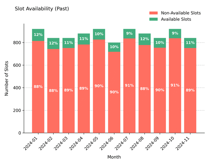
X-axis: Time periods (Year, Quarter, Month, or Week) dynamically chosen for readability.
Y-axis: Number of generated slots.
Bars: Stacked representation where the lower section shows filled (not available) slots and the upper section shows available slots.
Automatic aggregation: If bars would be too dense, the function automatically adjusts to a coarser frequency and appends the suffix “— auto-aggregated to {freq}” to the title.
Color coding: Greenish tone (
#43AD7E) for available slots; salmon tone (#FF6F61) for filled slots.Grid & legend: Subtle dashed Y-grid and upper-right legend enhance readability.
Example#
from medscheduler import AppointmentScheduler
from medscheduler.utils.plotting import plot_past_slot_availability

# Simulate baseline outpatient calendar
sched = AppointmentScheduler()
slots_df, appts_df, patients_df = sched.generate()

# Visualize historical slot utilization before the reference date
ax = plot_past_slot_availability(slots_df, scheduler=sched, freq="M") # Monthly aggregation
ax.figure.show()  # optional when running interactively
Output preview:
The chart below illustrates slot utilization prior to the reference date, aggregated monthly. It shows the proportion of available versus unavailable slots over time, reflecting past scheduling performance.
Next Steps#
Review slot configuration and calendar structure: Calendar structure
Learn how
ref_datedefines historical segmentation: Date ranges and reference dateCompare with upcoming availability: Visualizing Future Slot Availability
Explore fill rate and booking horizon settings: Booking dynamics