Visualizing Population Distribution by Age and Sex#
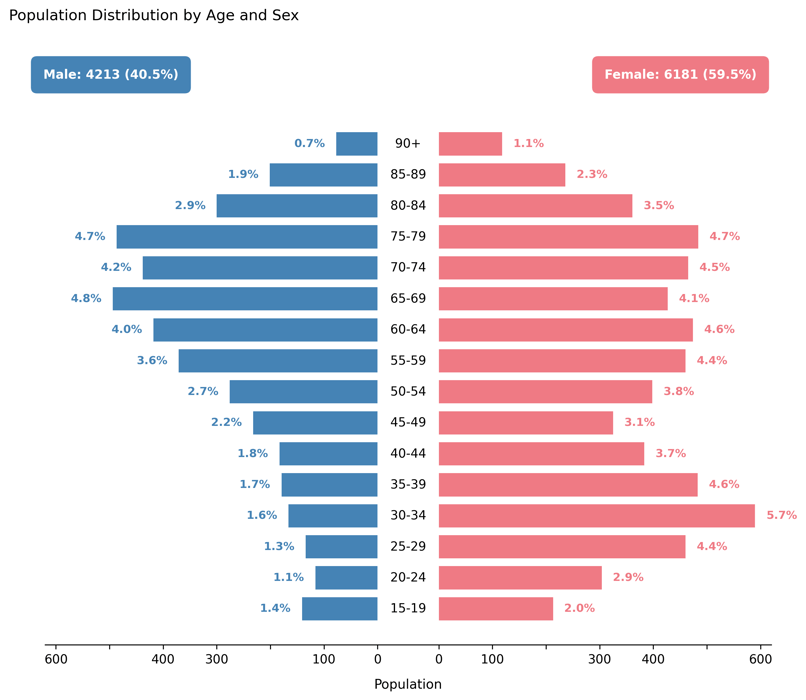
Displays a population pyramid showing the relative distribution of patients by age group and sex.
This visualization provides a demographic snapshot of the simulated patient cohort, helping assess whether the generated population matches expected real-world characteristics or custom configuration settings.
Function Overview#
Function: medscheduler.utils.plotting.plot_population_pyramid(df, *, age_col='age_group', sex_col='sex', male_label='Male', female_label='Female')
Inputs:
df (pd.DataFrame)— Patient table containing categorical columns for age and sex.age_col (str)— Column indicating age groups (e.g.,"0–17","18–29","30–44", etc.). Default:"age_group".sex_col (str)— Column indicating sex categories. Default:"sex".male_label (str)— Label representing male patients insex_col. Default:"Male".female_label (str)— Label representing female patients insex_col. Default:"Female".
Returns: matplotlib.axes.Axes — Horizontal population pyramid comparing male and female distributions across age groups.
Validation & error handling:
Missing required columns → raises
ValueError("DataFrame must contain columns: age_group, sex").Missing one of the two sex categories → raises
ValueError("Both 'Male' and 'Female' categories must be present.").
Output Description#
X-axis: Patient counts (negative for males, positive for females).
Y-axis: Ordered age groups (bottom = youngest).
Bars:
Left bars (blue) = male population.
Right bars (pink) = female population.
Center line: Displays age group labels along the middle axis.
Annotations:
Each bar labeled with its percentage share of total population.
Total counts and proportions displayed at the top for each sex.
Style: Balanced dual-sided layout with symmetric scaling, minimalist gridless design, and rounded colored total boxes for clarity.
This plot provides a clear, intuitive view of cohort composition and is particularly valuable for verifying age–sex balance in synthetic datasets or studying demographic biases.
Example#
from medscheduler import AppointmentScheduler
from medscheduler.utils.plotting import plot_population_pyramid

# Generate synthetic patient cohort
sched = AppointmentScheduler()
slots_df, appts_df, patients_df = sched.generate()

# Visualize demographic distribution
ax = plot_population_pyramid(appts_df)
ax.figure.show()  # optional in interactive sessions
Output preview:
The figure below presents a population pyramid showing the age and sex distribution of the simulated patient cohort. Male and female groups are displayed symmetrically to highlight demographic balance across age categories.
Next Steps#
Explore patient demographic generation parameters: Patient demographics
Review patient flow and attendance logic: Patient flow
Analyze appointment outcomes by status: Visualizing Appointment Outcomes by Status
Adjust demographic distributions via customization options: Customization options