Visualizing Patient Arrival Time Patterns#
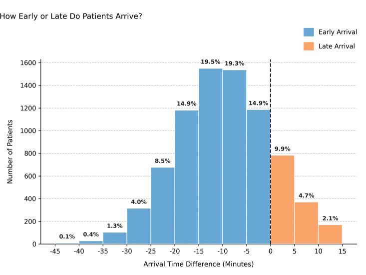
Shows how early or late patients arrive relative to their scheduled appointment time. This plot quantifies punctuality behavior across attended appointments and can highlight operational inefficiencies such as systematic early arrivals or chronic lateness.
Function Overview#
Function: medscheduler.utils.plotting.plot_arrival_time_distribution(df)
Inputs:
df (pd.DataFrame)— Appointment table containing the columnsstatus,check_in_time, andappointment_time.
Returns: matplotlib.axes.Axes — Histogram showing the frequency of early versus late arrivals.
Validation & error handling:
Missing required columns → raises
ValueError("DataFrame must contain columns: status, check_in_time, appointment_time").No attended rows or missing check-in data →
_empty_plot("No attended appointments with valid check-in times.").No valid computed differences →
_empty_plot("No valid arrival time differences available.").
Output Description#
X-axis: Difference between check-in time and appointment time (in minutes). Negative = early arrival; positive = late arrival.
Y-axis: Number of patients within each 5-minute bin.
Bars:
Early arrivals: Primary Medscheduler blue (
#67A7D4).Late arrivals: Secondary orange (
#f9a369).
Reference line: Vertical dashed line at 0 minutes marks on-time arrival.
Annotations: Each bar shows its relative percentage of total attended appointments.
Legend: Distinguishes early vs. late arrivals.
Style: Clear symmetric layout with dashed Y-grid and left-aligned title.
This visualization enables performance assessment around clinic punctuality, offering a clear understanding of patient behavior relative to appointment times.
Example#
from medscheduler import AppointmentScheduler
from medscheduler.utils.plotting import plot_arrival_time_distribution

# Generate synthetic appointment dataset
sched = AppointmentScheduler()
slots_df, appts_df, patients_df = sched.generate()

# Visualize early vs. late arrival patterns for attended patients
ax = plot_arrival_time_distribution(appts_df)
ax.figure.show()  # optional when running interactively
Output preview:
The chart below visualizes patient arrival patterns relative to scheduled appointment times, distinguishing early arrivals (blue) from late arrivals (orange) among attended patients.
Next Steps#
Compare arrival behavior with waiting times: Visualizing Patient Waiting Time Distribution
Review punctuality and attendance patterns: Attendance behavior
Analyze how scheduling affects flow dynamics: Patient flow
Explore timing variability and noise parameters: Randomness and variability