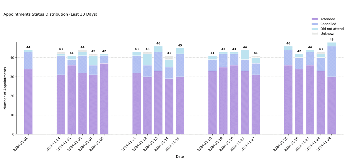
Visualizing Recent Appointment Status Trends#
Displays the daily distribution of appointment outcomes (e.g., attended, cancelled, did not attend, unknown) over the most recent N days preceding the scheduler’s reference date. This plot highlights short-term trends in attendance and cancellation patterns.
Function Overview#
Function: medscheduler.utils.plotting.plot_status_distribution_last_days(df, *, scheduler, days_back=30, date_col='appointment_date', status_col='status')
Inputs:
df (pd.DataFrame)— Appointment-level table containing at least the specifieddate_colandstatus_col.scheduler (AppointmentScheduler)— Must expose aref_dateattribute defining the temporal cutoff.days_back (int)— Number of days prior toref_dateto include. Default:30.date_col (str)— Column containing appointment dates. Default:"appointment_date".status_col (str)— Column containing appointment status categories. Default:"status".
Returns: matplotlib.axes.Axes — Stacked bar chart showing the daily count of appointments by status category for the last N days.
Validation & fallback behavior:
Missing required columns →
_empty_plot("DataFrame must contain columns: …").Scheduler without
ref_date→_empty_plot("Scheduler must have aref_dateattribute.").Empty filtered window →
_empty_plot("No data available in the last N days …").
Output Description#
X-axis: Calendar dates covering the last N days before
ref_date.Y-axis: Number of appointments per day.
Bars: Stacked by status category (
attended,cancelled,did not attend,unknown, etc.).Color coding: Uses the status color palette (
attended=#B69DE1,cancelled=#B3C1F2,did not attend=#BDE3F0,unknown=#E5E5E5).Labels: Each day displays a total count above the bar stack.
Grid & style: Dashed Y-grid, no top/right spines, left-aligned title, and legend positioned above the chart.
Error handling: Missing or empty inputs return a placeholder Axes via
_empty_plot()instead of raising errors (graceful fallback behavior).
This visualization is particularly useful for monitoring short-term attendance performance or detecting spikes in cancellations around specific periods.
Example#
from medscheduler import AppointmentScheduler
from medscheduler.utils.plotting import plot_status_distribution_last_days

# Generate synthetic appointment data
sched = AppointmentScheduler()
slots_df, appts_df, patients_df = sched.generate()

# Visualize appointment outcomes for the past 30 days
ax = plot_status_distribution_last_days(appts_df, scheduler=sched, days_back=30)
ax.figure.show()  # optional when running interactively
Output preview:
The stacked bar chart below shows the distribution of appointment outcomes (attended, cancelled, did not attend, etc.) over the last 30 days before the reference date. Each bar represents a single day, with colors indicating status categories.
 #
#
Next Steps#
Explore the forward-looking version: Visualizing Upcoming Appointment Status Forecast
Review appointment outcome definitions and probabilities: Attendance behavior
Learn how
ref_datepartitions the dataset: Date ranges and reference dateAnalyze short-term appointment outcomes: Visualizing Appointment Outcomes by Status