Adding Custom Categorical Variables#
Overview#
Beyond demographic and scheduling parameters, AppointmentScheduler allows extending the synthetic dataset with new categorical variables — such as insurance type, geographic region, or clinic branch — using the add_custom_column() method.
These additional fields enrich the simulated patient table (patients_df) without altering the core data-generation process.
You will explore:
Adding a balanced attribute (uniform distribution).
Adding a skewed regional attribute (normal distribution).
Adding a highly imbalanced attribute (Pareto distribution).
Example 1 – Uniform distribution (balanced attribute)#
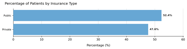
A new variable insurance_type evenly splits the population into Public and Private coverage.
from medscheduler import AppointmentScheduler
from medscheduler.utils.plotting import plot_custom_column_distribution

# Generate baseline dataset
sched_uniform = AppointmentScheduler()
slots_df, appts_df, patients_df = sched_uniform.generate()

# Add insurance type with uniform probability
sched_uniform.add_custom_column(
    column_name="insurance_type",
    categories=["Public", "Private"],
    distribution_type="uniform"
)

plot_custom_column_distribution(patients_df, column="insurance_type")
Output preview:
Below are the main results for this configuration:
Category distribution – Nearly equal proportions across insurance groups.
Interpretation:
Uniform distributions are ideal for balanced segmentation variables, ensuring each group is equally represented — useful for fair testing or visualization purposes.
Example 2 – Normal distribution (regional variation)#
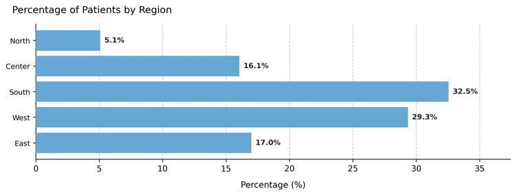
Now we introduce a three-region attribute, with the central region most frequent and the outer ones less represented.
sched_region = AppointmentScheduler()
slots_df, appts_df, patients_df = sched_region.generate()

sched_region.add_custom_column(
    column_name="region",
    categories=["North", "Center", "South", "West", "East"],
    distribution_type="normal"
)

plot_custom_column_distribution(patients_df, column="region")
Output preview:
Category distribution – Bell-shaped distribution with a dominant “Center” group.
Interpretation:
The normal model generates a realistic middle-heavy pattern, useful for representing geographically centered populations or other naturally clustered attributes.
Example 3 – Pareto distribution (dominant providers)#
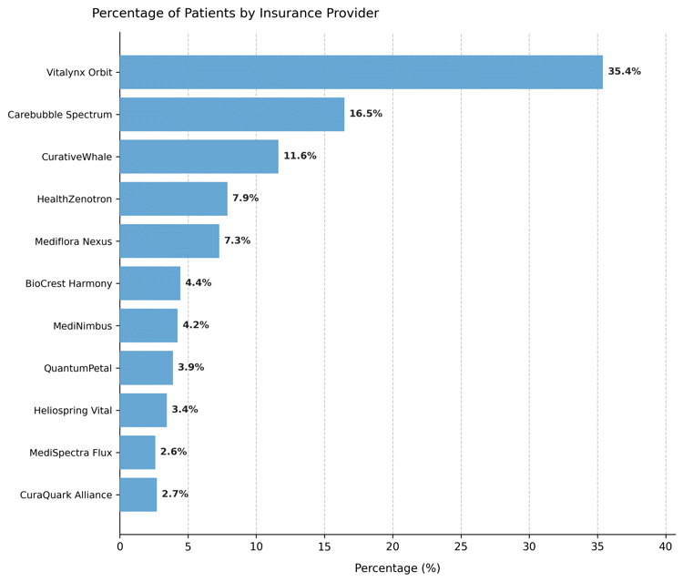
Finally, we simulate a field representing health insurance providers, where a few dominate the market while others serve smaller shares.
sched_pareto = AppointmentScheduler()
slots_df, appts_df, patients_df = sched_pareto.generate()

sched_pareto.add_custom_column(
    column_name="insurance_provider",
    categories=[
        "Vitalynx Orbit", "Carebubble Spectrum", "CurativeWhale",
        "HealthZenotron", "Mediflora Nexus", "BioCrest Harmony",
        "MediNimbus", "QuantumPetal", "Heliospring Vital",
        "MediSpectra Flux", "CuraQuark Alliance"
    ],
    distribution_type="pareto"
)

plot_custom_column_distribution(patients_df, column="insurance_provider")
Output preview:
Category distribution – Heavily right-skewed proportions showing a few dominant insurers.
Interpretation:
The Pareto model mirrors real-world skewness, where a small number of categories account for most observations.
Such variables are useful when simulating unequal resource distribution or modeling provider market share.
Summary#
Scenario |
Distribution type |
Typical shape |
Use case |
|---|---|---|---|
Insurance type |
Uniform |
Flat |
Balanced segmentation |
Region |
Normal |
Bell-shaped |
Central dominance |
Insurance provider |
Pareto |
Right-skewed |
Market inequality |
Notes#
Each column is reproducible under the same
seed.Probabilities can also be manually supplied via
custom_probs.Added fields integrate seamlessly into
patients_dffor analysis, joining, or visualization.
Next Steps#
Review Patients table to see how these columns integrate into patient data.
Explore Randomness and variability for details on stochastic sampling.
Combine with demographic or flow parameters to create richer simulation scenarios.
Return to Patient Flow and Demographic Structure to visualize how added attributes interact with baseline population structure.